loading...

Free shipping for orders above £159.00

Colour Psychology at Home

The Psychology of Color in Interior Spaces

The Psychology of Color in Interior Spaces

A practical guide to colour psychology at home

Selected products and materials for colour psychology at home

Selected products and materials for colour psychology at home

Colour is experienced through more than hue. Lightness, saturation, surrounding materials, surface texture and illumination all change its effect. A pale muted blue and a deep saturated blue may share a name yet create very different spatial impressions. Warm colours can feel advancing or enveloping, while cooler colours may appear more distant, but these are tendencies rather than universal rules. Cultural associations, memories, age, current mood and the purpose of the room influence interpretation.

The Psychology of Color in Interior Spaces

How Colour Shapes Atmosphere

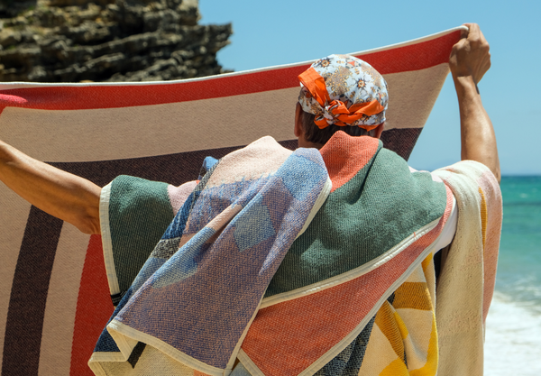
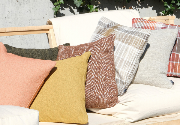
Hue identifies the colour family, but value—how light or dark it is—and saturation—how intense or muted—often determine whether a room feels open, intimate, quiet or energetic. Lighter surfaces generally reflect more light and can make boundaries feel less dominant. Darker colours can give walls or textiles greater visual weight and create a more enclosed composition. Highly saturated accents attract attention quickly, while softened tones integrate more easily across large surfaces.

Practical Choices and Styling

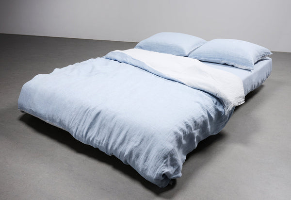
Begin with the experience the room should support, then translate that aim into colour relationships rather than a single prescribed hue. A bedroom may benefit from low contrast and softened values because visual quiet supports rest, but the palette could be warm, cool or mixed depending on the occupants. A living room can carry stronger contrast where conversation and activity occur. Offices often need enough variation to remain engaging without creating distracting visual competition.

Practical Choices and Styling

FROM THIS ARTIST / ZZ RECOMMENDATIONS

The Psychology of Color in Interior Spaces The Psychology of Color in Interior Spaces

Designed to last: colour

The psychology of colour in interior spaces is compelling because colour is both physical and personal. It changes the light reflected around a room, alters the visibility of boundaries and objects, and carries associations built through culture and memory. Yet this complexity is exactly why simple formulas should be treated cautiously. Blue is not automatically calming in every shade and situation; red does not inevitably create energy; white is not always neutral. Value, saturation, proportion, material and context can reverse or complicate the expected effect. Begin with light. A colour is visible only through illumination, and the same wall or textile can shift dramatically from morning to evening. Consider proportion next. Material gives colour emotional depth.

YOUR CART IS EMPTY